Pelley Construction Branding
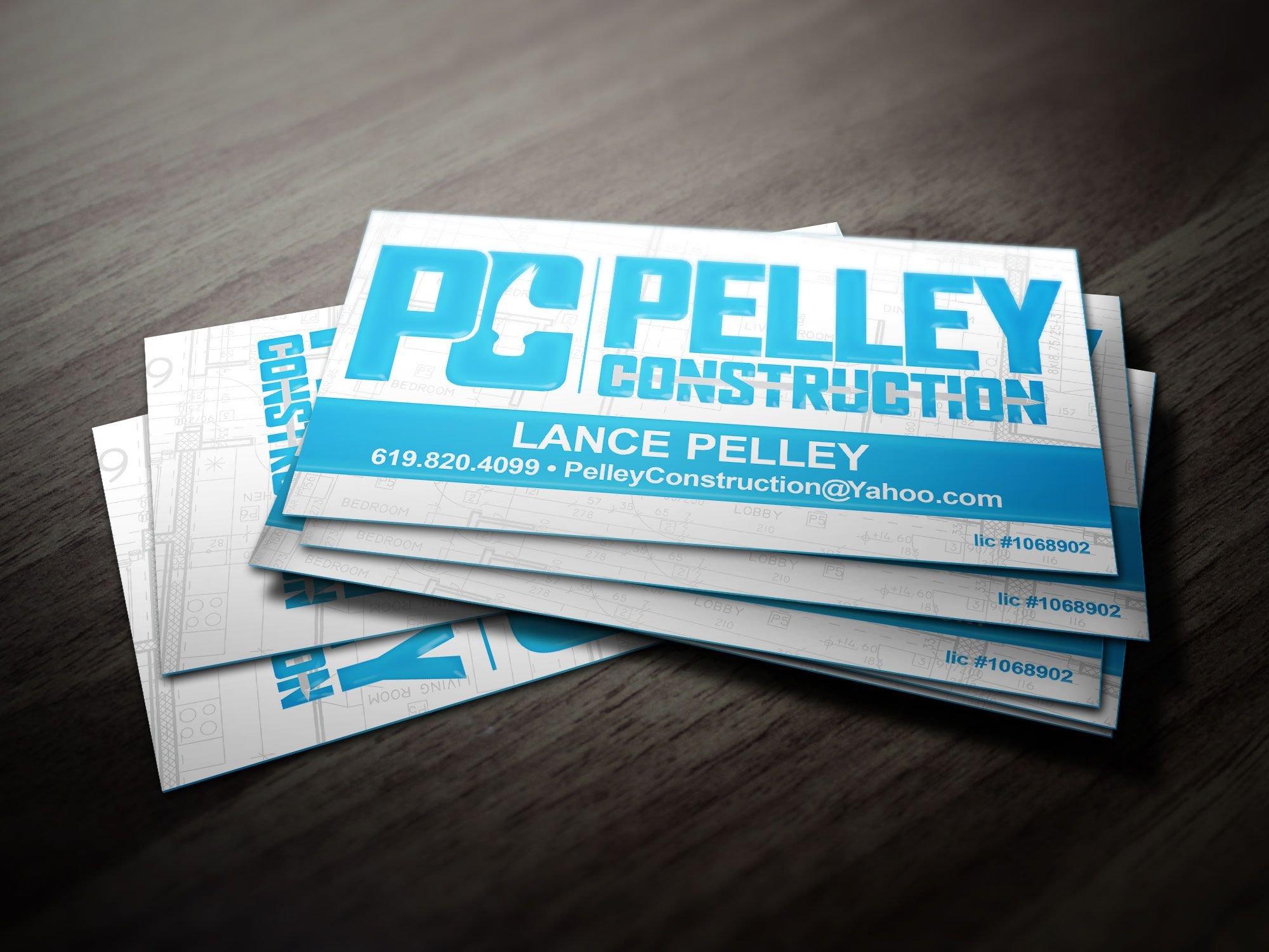
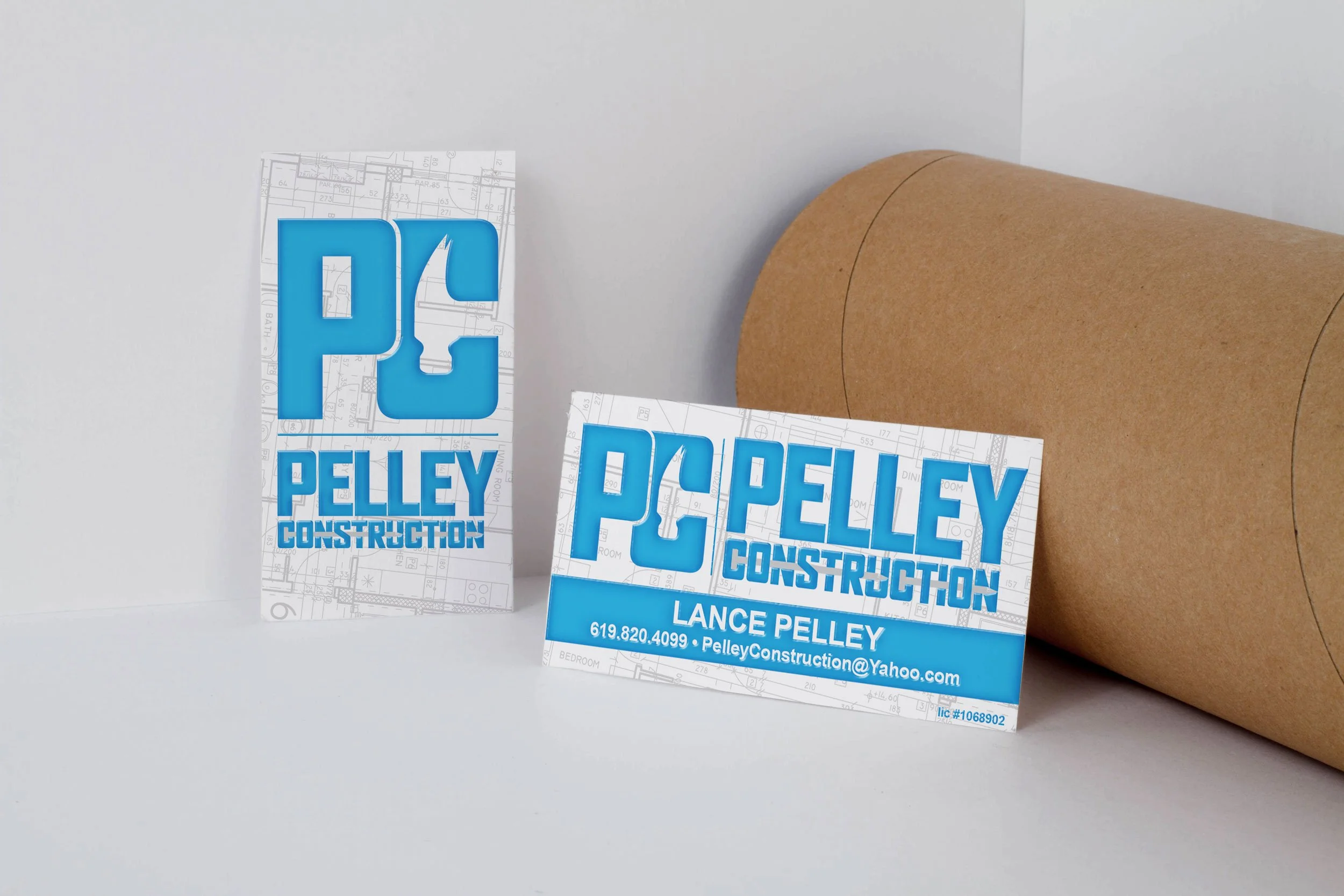
A few years back now, I had the chance to design a logo and business card package for a good friend of mine from high school who launched his own company, Pelley Construction.
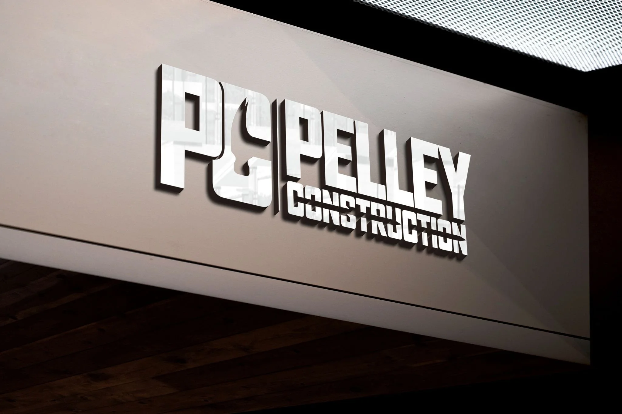
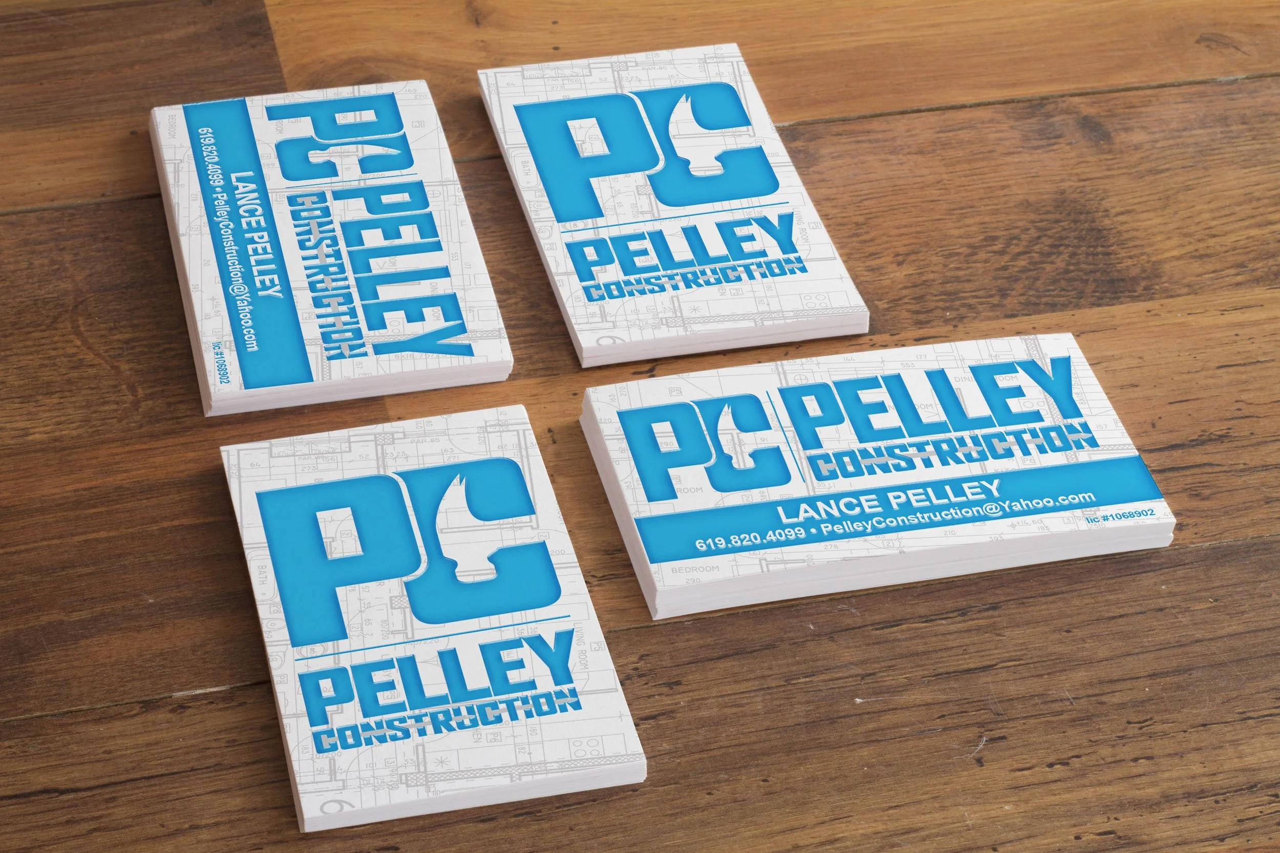
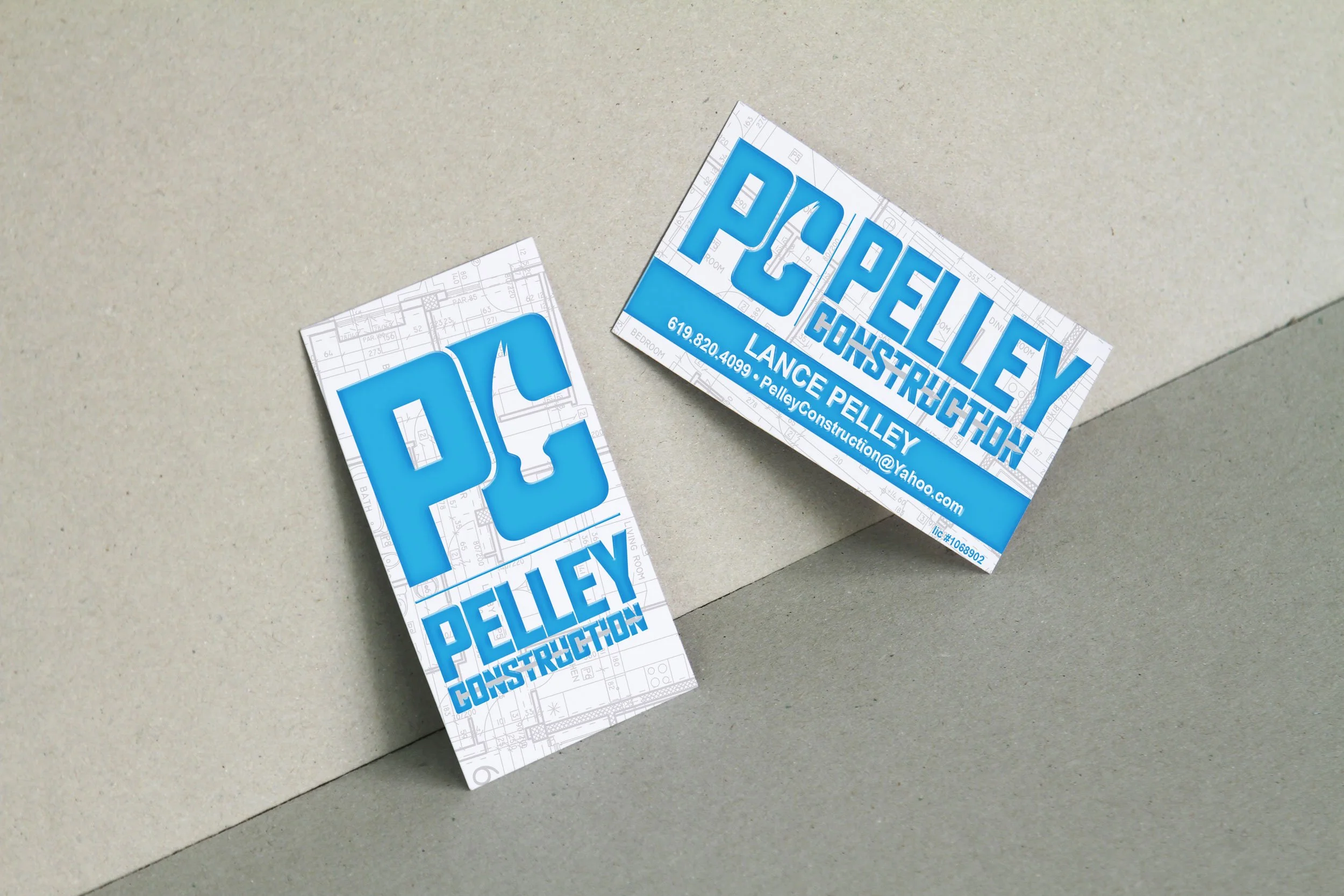
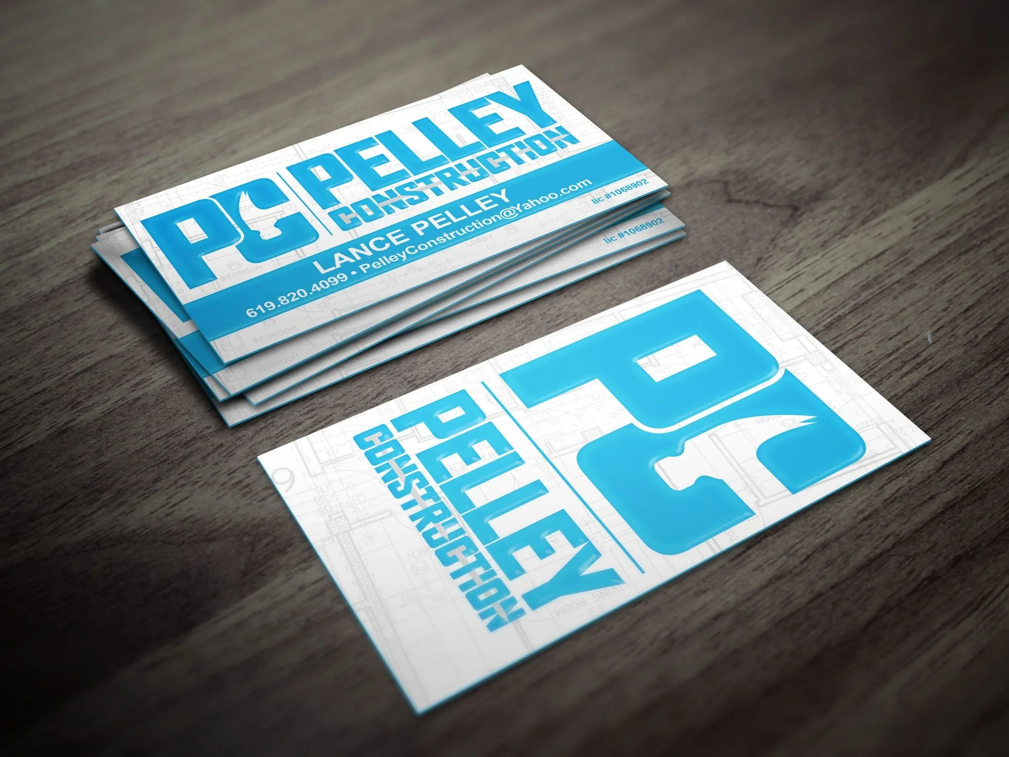
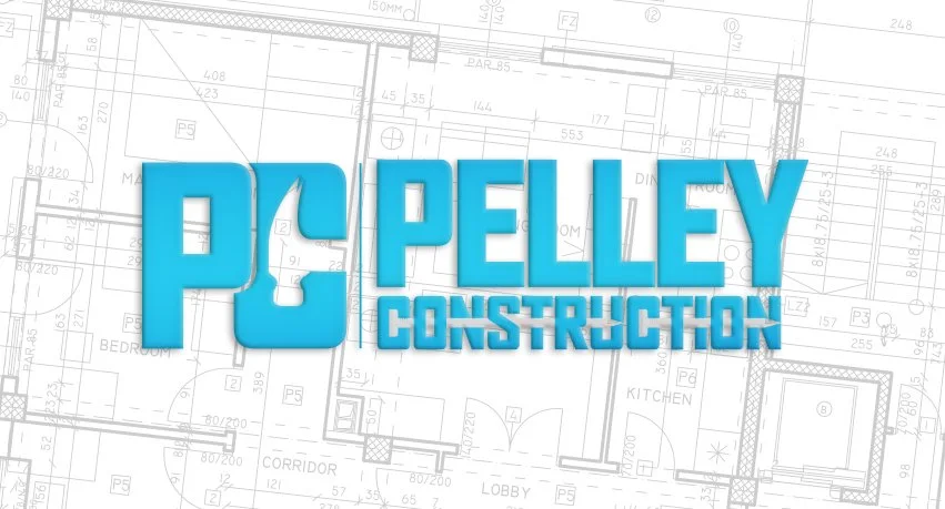
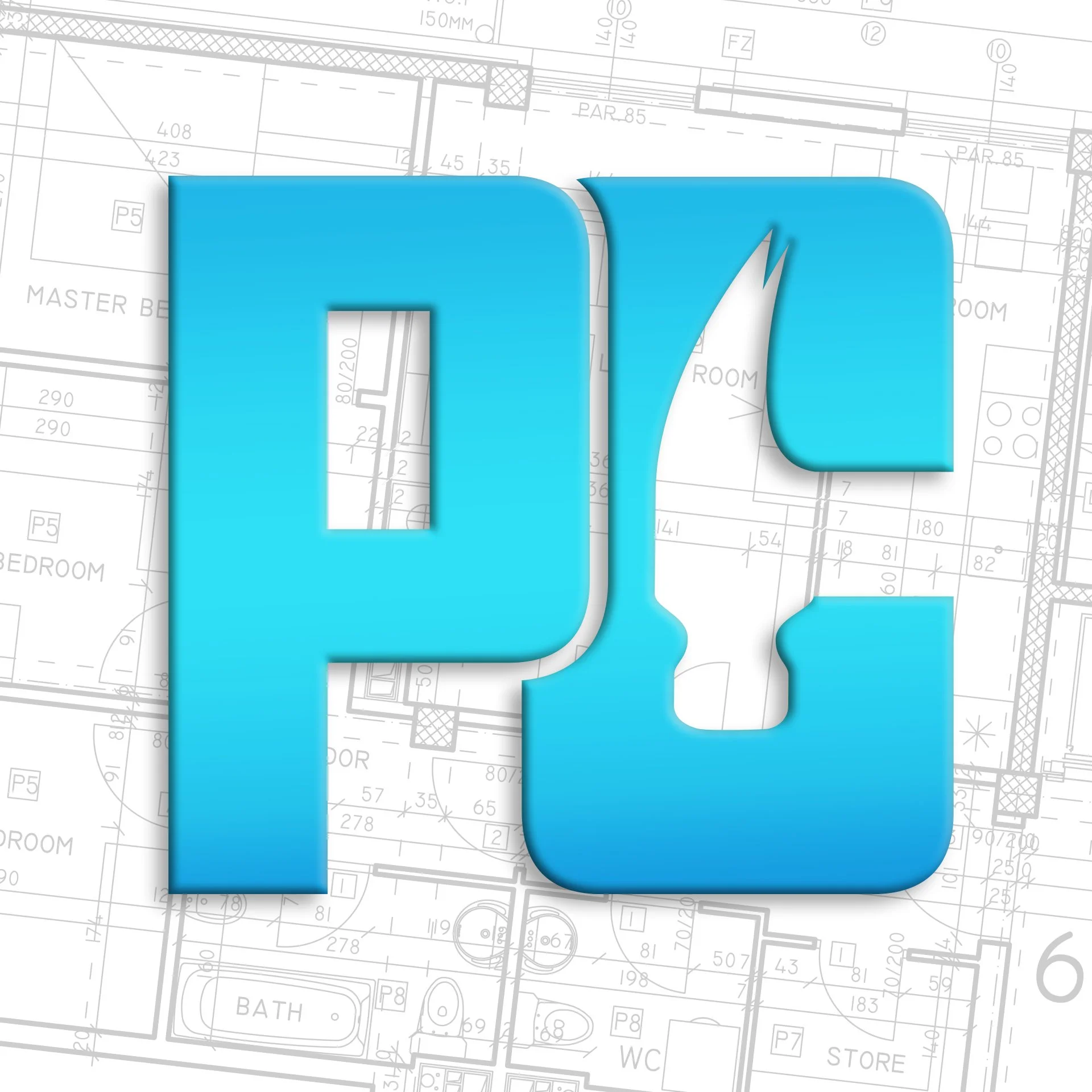
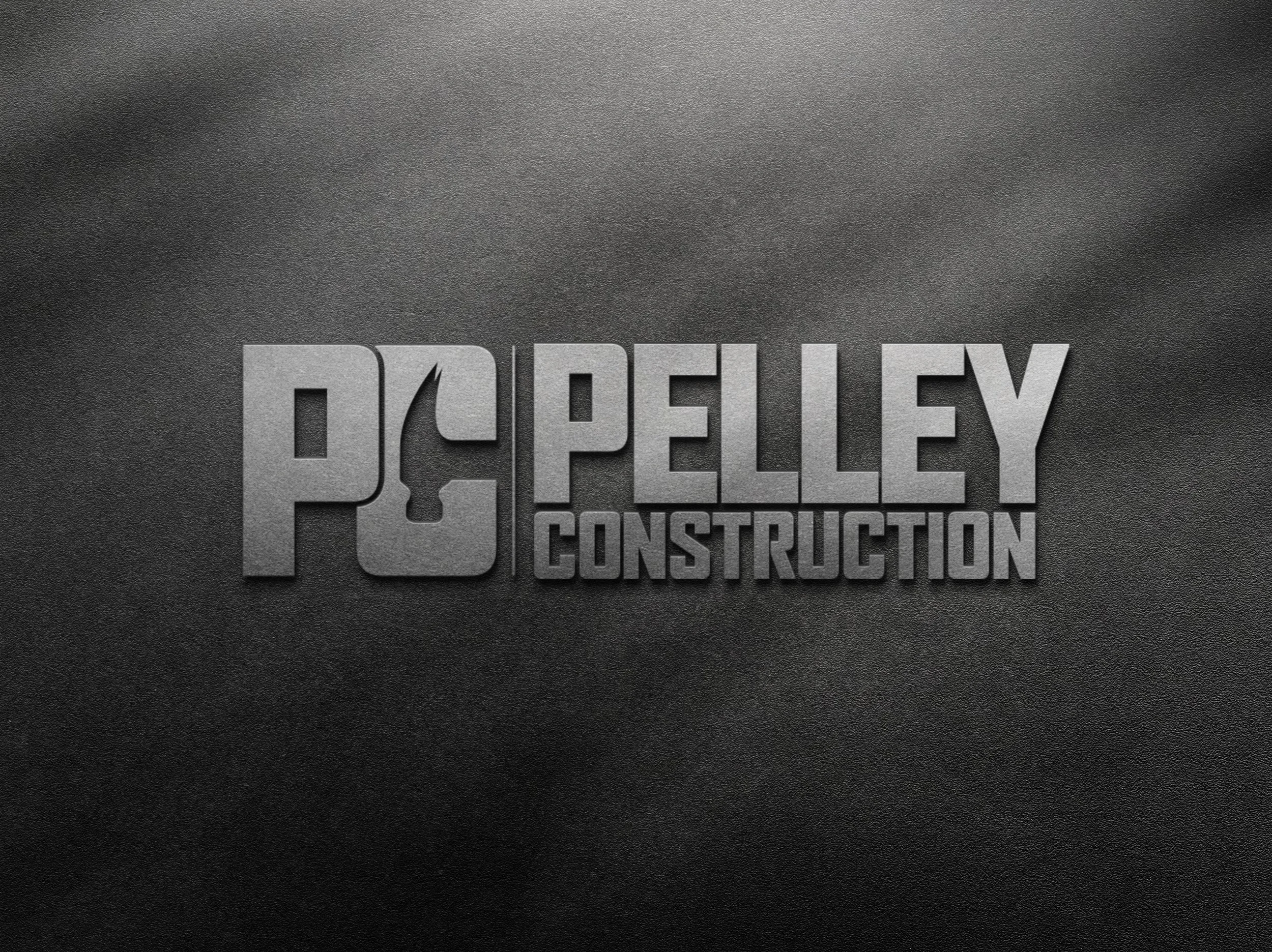
This project was especially fun because I was able to experiment with negative space in the logo design—most notably the hammer head integrated into the “C” and a subtle pair of nails running through the word CONSTRUCTION. These small details gave the mark personality and tied it back to the trade in a clever, meaningful way.
The business card design carried the same bold, professional energy. Printed on extra-thick silk stock with gloss UV and a colored edge, the card has a strong, heavy feel—perfectly suited for someone in construction. The final product is both durable and eye-catching, and my client was thrilled with the result (and so was I!).
This project was a great reminder of how thoughtful design choices, from concept to print finishes, can create branding that feels personal, professional, and memorable.
#LogoDesign #BusinessCardDesign #ConstructionBranding #GraphicDesign #BrandIdentity #CreativeDesign #PrintDesign #NegativeSpaceDesign #DesignDetails #BrandingMatters #JohnStokesCreative #SeniorGraphicDesigner