SCL Dirtworks Branding
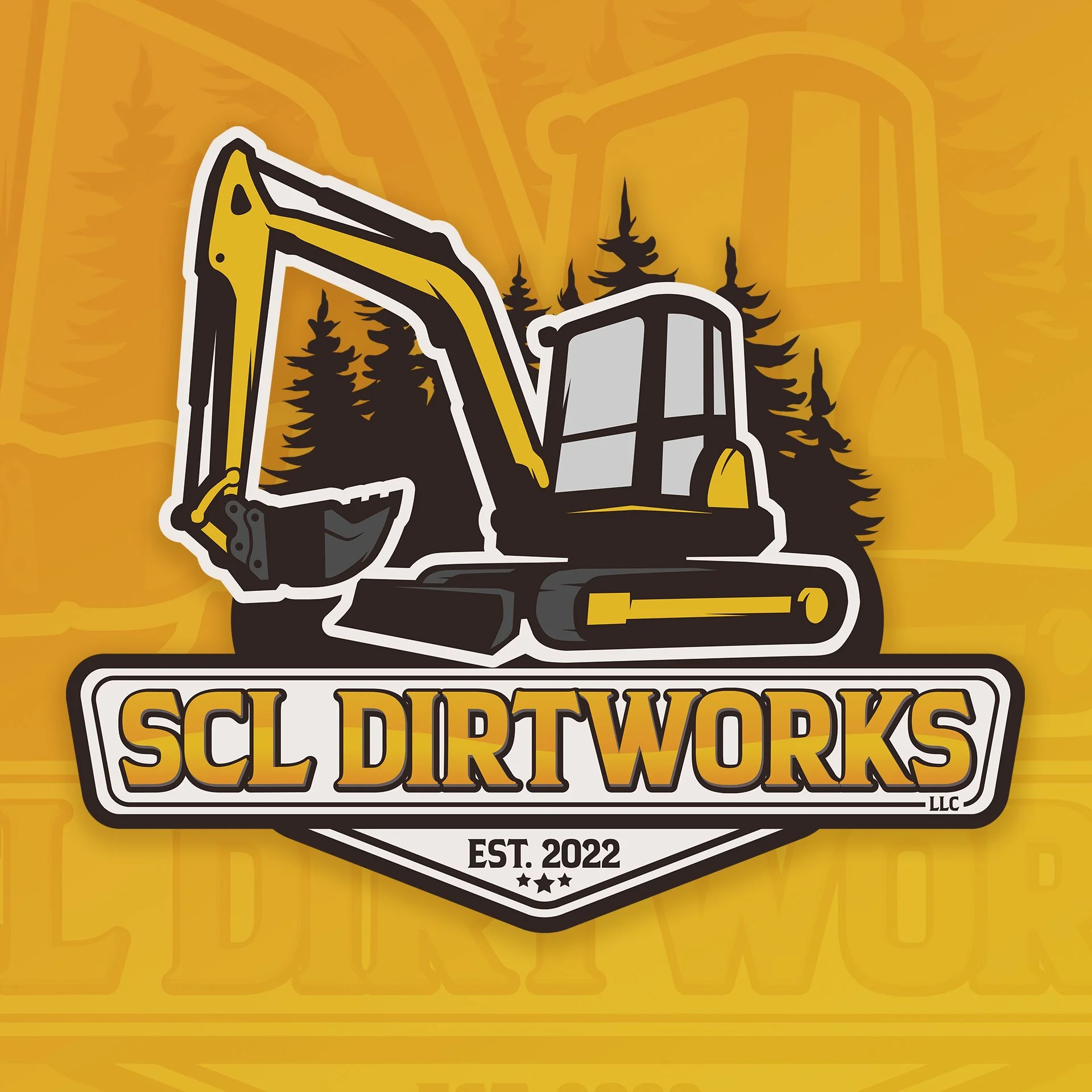
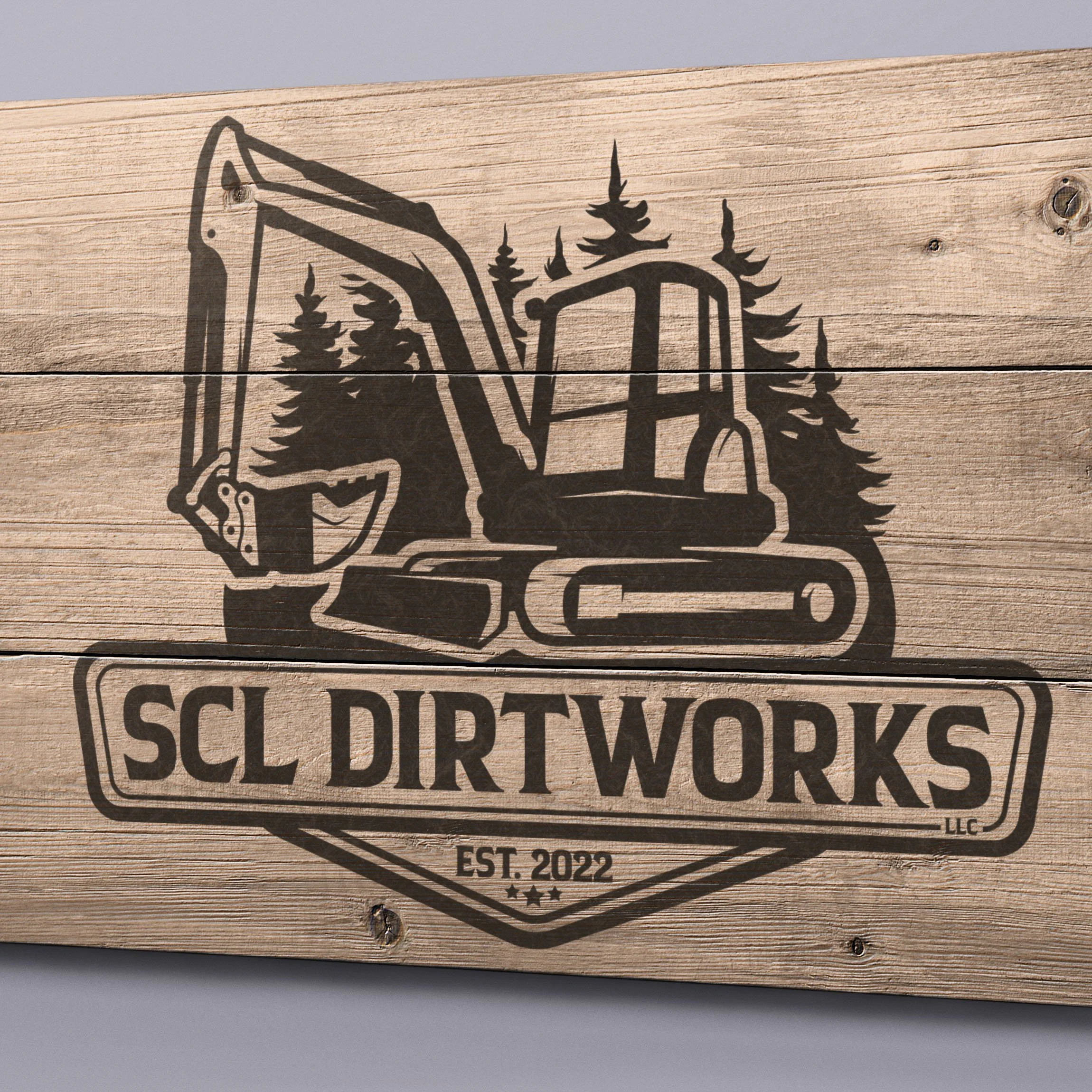
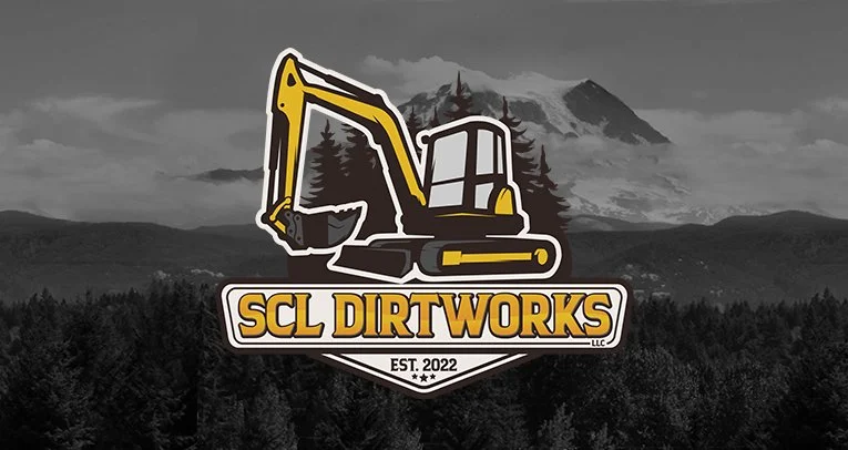
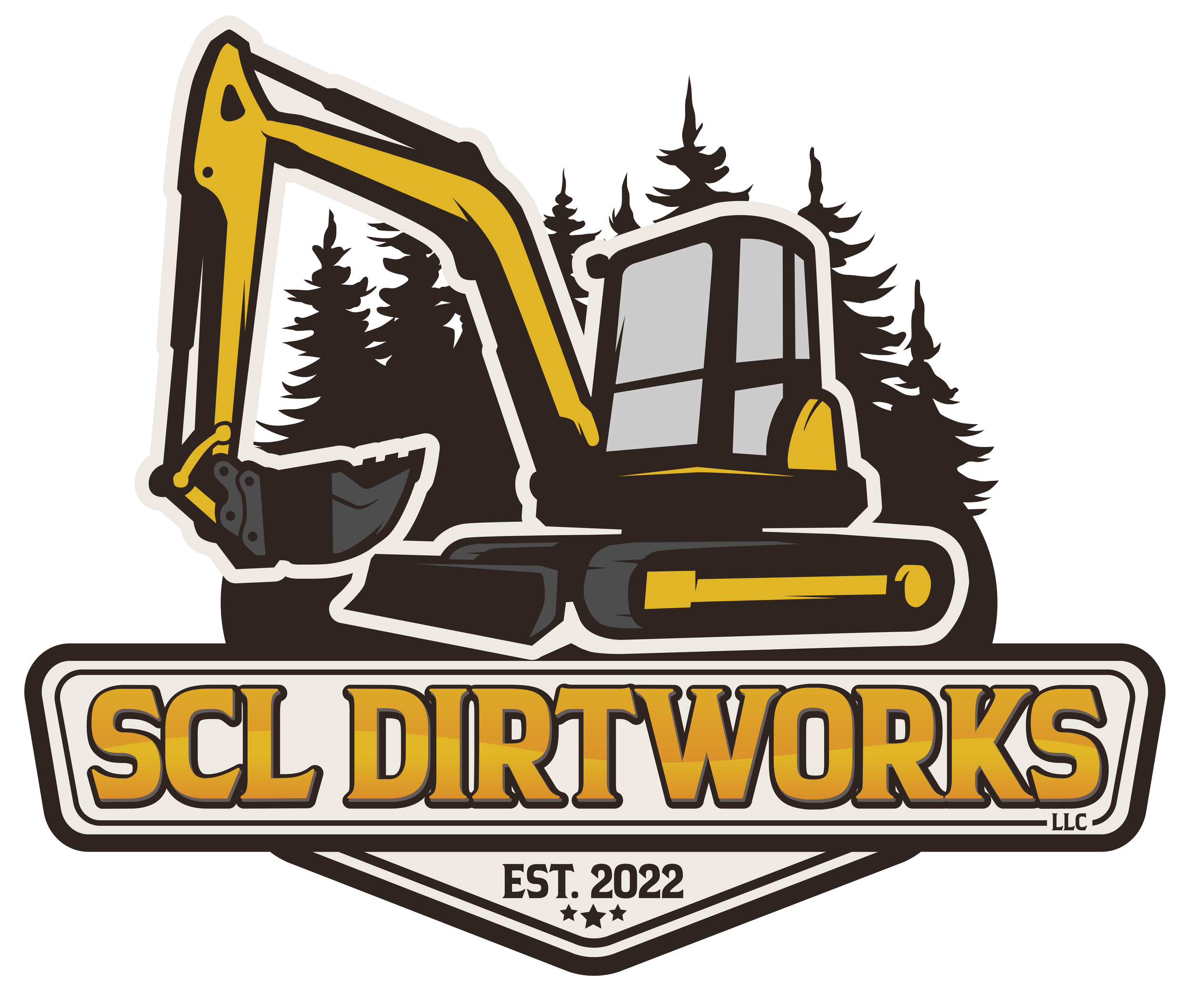
A while back, I had the honor of creating the logo for SCL Dirtworks, a family-owned company built on hard work and pride. The design blends strength and heritage, with details that highlight both their roots and their mission.
The excavator represents the core of their work—moving earth, building foundations, and getting the job done right... and was illustrated from an actual photo of the owners rig. Behind it, the evergreen trees pay tribute to the Great Northwest, near Mount Rainier, where the company calls home. At the base, the three stars beneath the established date hold a deeper meaning: the father (owner) and his two sons, symbolizing family unity and the generations of effort behind the business.
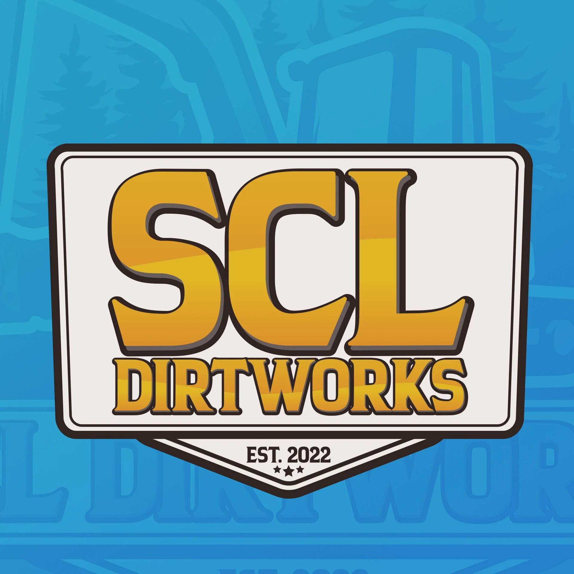
The bold, modern lettering ensures the logo stands strong across all mediums—from heavy equipment to uniforms, signage, and digital platforms—making it versatile while staying true to the company’s character.
#LogoDesign #GraphicDesign #BrandIdentity #FamilyBusiness #PNWBusiness #ConstructionLogo #DesignWithMeaning #GraphicDesigner #SCLDirtWorks